A landing page is a marketer’s best friend when it comes to capturing new leads. That's because landing pages enable us to direct visitors, from sources such as Google Adwords, Facebook or an email campaign, to specifically targeted pages that have been optimized for them. In fact, landing pages are one of the most crucial components to the Inbound Methodology!
While the purpose of a landing page is to convert, it takes a few tools and techniques to get the job done right. These 7 hacks will help get you on your way to creating highly converting landing pages.
Focus the page around your CTA
Your call-to-action should be the first thing someone sees when they click on your landing page, which also means it should be visually distinctive and compelling. All of the components on the page, such as headline, supporting copy and graphics should be supportive of the call-to-action. Remember the goal here is to inspire the audience to do something. You’ll want to utilize action words that demonstrate value, such as “Get my free report” versus command words such as such as “Submit.” Here are a few examples of short and effective calls-to-action: Sign up. Try for free. Get started. Learn more. Join us.
Ask for the minimum amount of information
Nobody likes a tough gatekeeper when it comes to retrieving information. The longer the registration form is, the lower your conversion rate tends to be. People are only willing to give their data away if the offer is worth the nuisance. While best practices will tell you that both short and long forms can perform well, however, it all depends on whether you want to generate a lot of (potentially) lower-quality form submissions, or a smaller number of higher-quality submissions that is worth the cost to the participant. There is no right answer to this, but the best practice is to collect only the information you really need.
Remove the main navigation
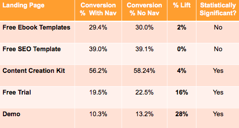
The landing page should be free from all distractions that don’t point to your call-to-action. This includes your typical main page navigation bar. If there are links on the page that entice users to move about your website instead, you are less likely to guide them down the sales funnel and convert them into a lead.
In a study conducted by Hubspot, an A/B test revealed that removing links from landing pages increases conversion rates. Version A featured a control landing page with top navigation, footer navigation, and social media share links and Version B featured a page removed of all external links, including the top navigation, footer navigation, and social media share links. Here’s what the raw data looked like:
Keep it short, sweet and to the point
A landing page is focused on conversion, guiding visitors to your call-to-action. For that to happen, a combination of elements needs to come together seamlessly. Colors, font type and size, whitespace, and graphics all go into creating a visitors overall experience. To avoid distractions with all of these elements, it’s best to keep it as simple and clean as possible.
Your headline should be short, sweet, and gets to the point quickly. Your supporting copy should be brief and relevant. Remember that the landing page headline is a visitors very first impression of your product/service. If they are inspired by a bold and persuasive statement, this will capture their interest and make them want to learn more.
Take advantage of responsive design
When creating a landing page, make sure you use responsive design that looks good on any device. Responsive design is an approach to web page creation that makes use of flexible layouts, flexible images and cascading style sheet media queries. The goal of responsive design is to build web pages that detect the visitor's screen size and orientation and change the layout accordingly. And because responsive web design is mobile-friendly – it helps increase visibility on search engines, which in return can help increase the number of visitors to your landing page!
A/B test different versions
Perhaps the ultimate hack for creating highly converting landing pages is to test multiple versions and gather reliable data on what your audience responds best to. A/B tests, or split tests, show you how one change (such as a different headline) affects your conversion rate. In other words, you can show version A of a piece of marketing content to one half of your audience, and version B to another. A/B testing is valuable because audiences behave differently. Something that works for one company may not necessarily work for another.